September 23, 2016RANCH HAND RE-BRAND
Re-branding a company’s messaging, design and culture is hard. A successful campaign requires more than a revamped logo. It demands a vision that inspires customers and employees to see the company in a new light. Effective and creative re-branding can revive a company – making it stronger than ever. With the hiring of our new VP of Marketing, Jerry Courtney, and the partnership with Kaspar Companies’ internal ad agency, Espresso, that’s exactly what we set out to do.
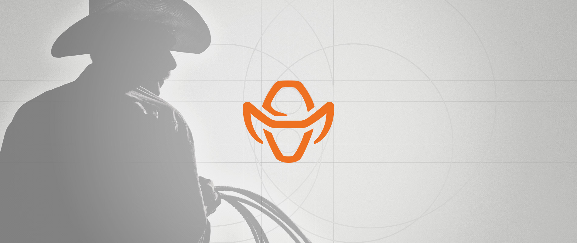
Often times simple things prove to be the most challenging. As ideas for the new logo began to be sketched, we quickly realized that we needed to create a logo that was either extremely realistic, or minimalist – anything in between was too cartoonish. After much heated discussion around potentially eliminating the cowboy object – which appeared in past Ranch Hand logos – we decided we couldn’t step away from such an integrated icon and a visual definer of the essence and values of the spirit of Ranch Hand.


Our primary goal was to modernize the brand without detracting from the core tenants of who we are. The result? A simplistic, easily recognizable logo with deep historic roots depicting the old – and the new – Ranch Hand brand.

The rigorous logo process ended in a glorious reveal as the team finally condensed the concepts from twenty down to five, from five down to three and from three down to one. Alas, the new and improved Ranch Hand logo had finally reached its inauguration, achieved the final iteration and found its place on a smorgasbord of branded product lines and new company paraphernalia.
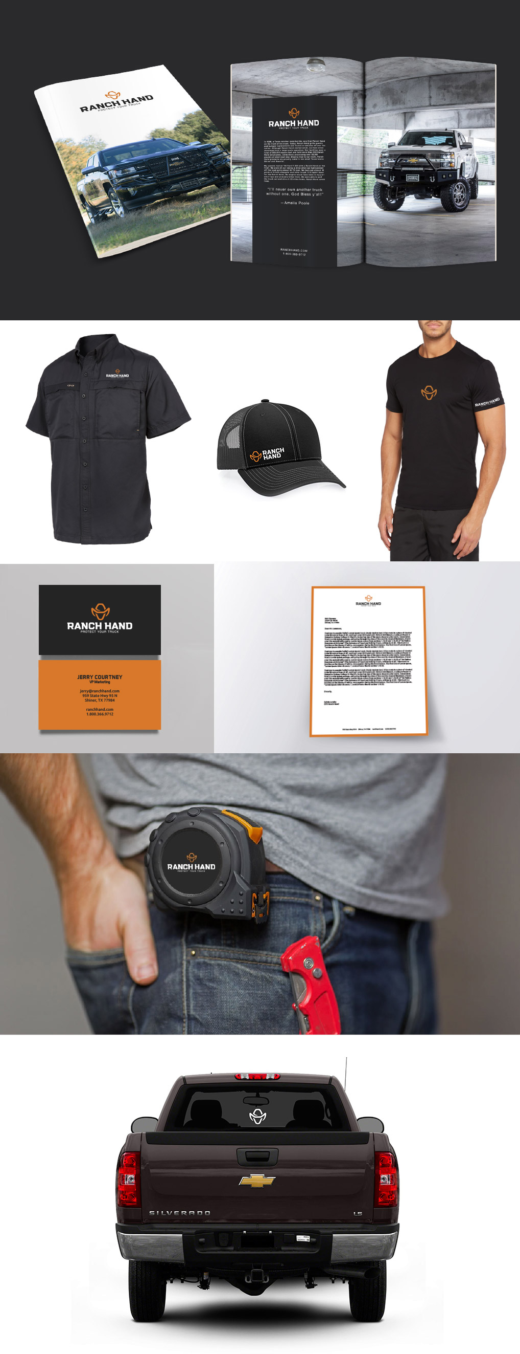
Not only did we create an easily recognizable logo, a new design scheme, and supplementary visual extensions – that incorporated the old and introduced the new – we also flipped the tagline a bit to better communicate the true purpose of Ranch Hand products.
Be on the Safe Side turned into
Protect Your Truck. Ranch Hand is the largest player in an industry with huge growth potential. The growth of the industry will come through education, and Ranch Hand plans on leading that charge. “Installing a Ranch Hand product should be considered a purchase similar to a carseat. It’s really a no-brainer when it comes to protecting your expensive vehicle and the loved ones inside that vehicle,” said Jerry Courtney. “We purposefully stayed away from ‘cute’ when choosing a tagline and went for a very literal statement. We want people to understand the ‘Why?’ at very first glance.”

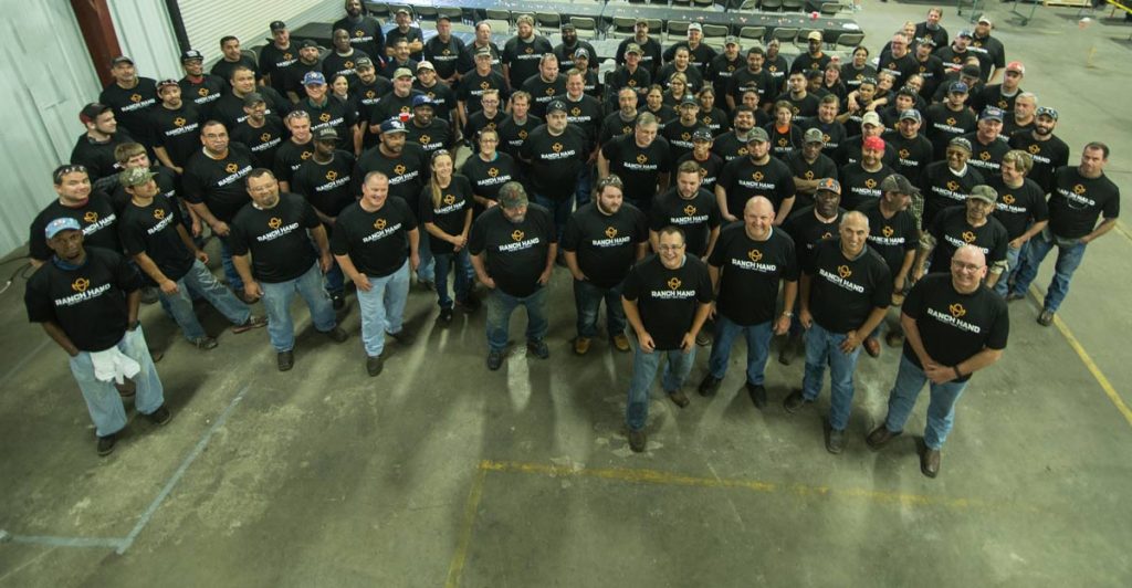
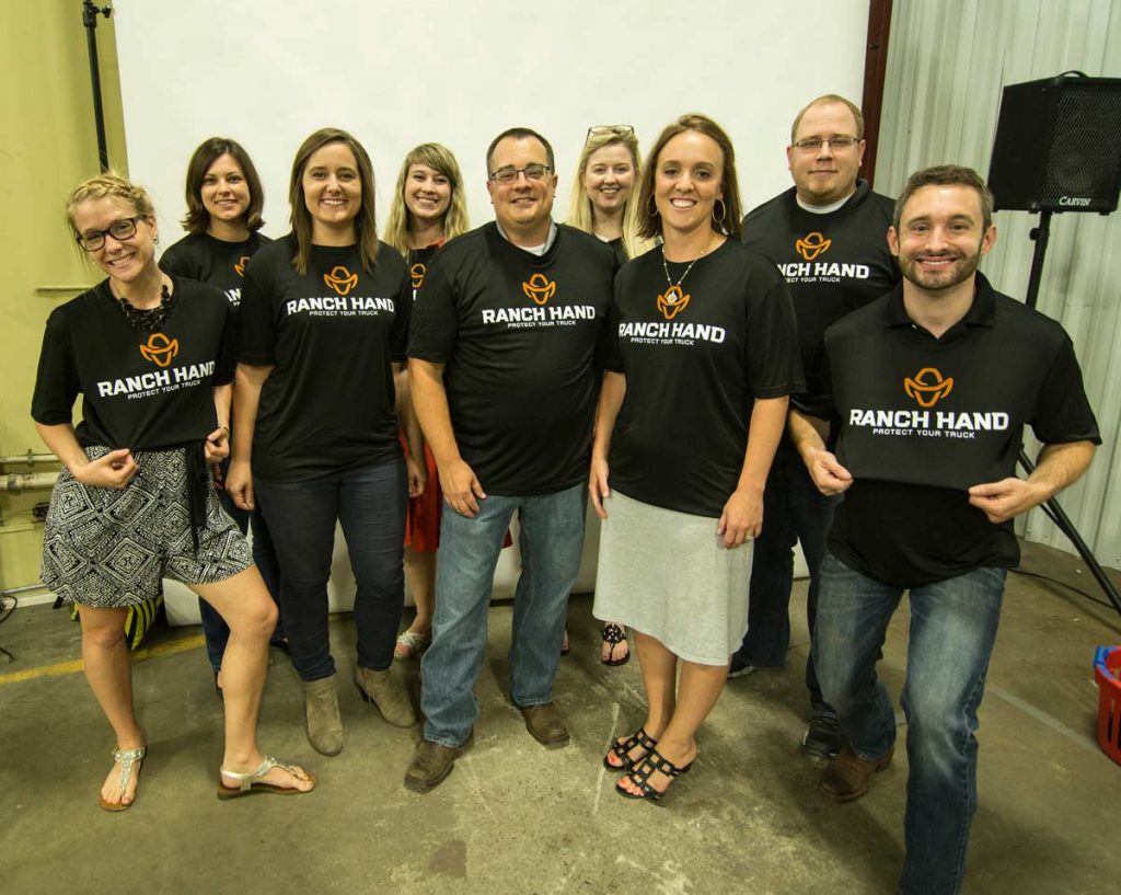
The Ranch Hand rebrand was the most challenging and rewarding identity design process Ranch Hand has experienced. We look forward to seeing the Ranch Hand cowboy on the back glass of trucks all over America and the strong black grilles and bumpers leading the way.
Learn more about the Ranch Hand rebrand here:
Ranch Hand Logo Design from
Espresso on
Vimeo.